Inferential statistics and scatter plots
Objectives
- Be able to calculate t-tests in Python.
- Use a simulation approach to understand false positives and multiple comparisons issues.
- Know how to create a figure to visualise relationships via scatter plots.
- Be able to evaluate correlations in Python.
In this lesson, we will be investigating how we can use Python to calculate basic inferential statistics. We will also use programming to develop an increased intuition about some of the issues involved in statistics (particularly multiple comparisons considerations) and understand how to visualise relationships using scatter plots.
Comparing two independent means—t-tests
The first inferential statistic we will investigate is the independent-samples t-test, which is useful for comparing the means of two independent groups. As before, we will simulate the data that we might get from a between-subjects experiment with two conditions and 30 participants per condition. In our simulation, the effect size of the condition manipulation is ‘large’ (Cohen’s d = 0.8).
import numpy as np

n_per_group = 30

# effect size = 0.8
group_means = [0.0, 0.8]
group_sigmas = [1.0, 1.0]

n_groups = len(group_means)

data = np.empty([n_per_group, n_groups])
data.fill(np.nan)

for i_group in range(n_groups):

    data[:, i_group] = np.random.normal(
        loc=group_means[i_group],
        scale=group_sigmas[i_group],
        size=n_per_group
    )

assert np.sum(np.isnan(data)) == 0
Now that we have the data in an array form, computing the t-test is straightforward.
We can use the function in scipy.stats called scipy.stats.ttest_ind (note that there is also scipy.stats.ttest_rel and scipy.stats.ttest_1samp).
This function takes two arrays, a and b, and returns the associated t and p values from an independent-samples t-test.
import numpy as np

import scipy.stats

n_per_group = 30

# effect size = 0.8
group_means = [0.0, 0.8]
group_sigmas = [1.0, 1.0]

n_groups = len(group_means)

data = np.empty([n_per_group, n_groups])
data.fill(np.nan)

for i_group in range(n_groups):

    data[:, i_group] = np.random.normal(
        loc=group_means[i_group],
        scale=group_sigmas[i_group],
        size=n_per_group
    )

assert np.sum(np.isnan(data)) == 0

result = scipy.stats.ttest_ind(a=data[:, 0], b=data[:, 1])

print "t: ", result[0]
print "p: ", result[1]
t:  -2.70165907646
p:  0.00903195285755
Demonstrating the problem with multiple comparisons
Now, we will use programming to hopefully develop more of an intuition about the operation of inferential statistics and why we need to think about the consequences of performing multiple comparisons. To simplify matters, we will switch to a one-sample design where we are looking to see if the mean is significantly different from zero. In contrast to our previous example, here the mean of the population that we sample from will actually be zero. We will perform a large number of such ‘experiments’ and see how often we reject this null hypothesis. Remember: because we are controlling the simulation, we know that there is no true difference between the population mean and 0.
import numpy as np

import scipy.stats

n = 30

pop_mean = 0.0
pop_sigma = 1.0

# number of simulations we will run
n_sims = 10000

# store the p value associated with each simulation
p_values = np.empty(n_sims)
p_values.fill(np.nan)

for i_sim in range(n_sims):

    # perform our 'experiment'
    data = np.random.normal(
        loc=pop_mean,
        scale=pop_sigma,
        size=n
    )

    # perform the t-test
    result = scipy.stats.ttest_1samp(a=data, popmean=0.0)

    # save the p value
    p_values[i_sim] = result[1]

assert np.sum(np.isnan(p_values)) == 0
Ok, so now we have generated 10,000 p values from a situation in which we know that the population mean was not actually different from 0. We are interested in how many of those 10,000 ‘experiments’ would yield a p value less than 0.05 and would lead to a false rejection of the null hypothesis. What would you predict? Let’s have a look:
import numpy as np

import scipy.stats

n = 30

pop_mean = 0.0
pop_sigma = 1.0

# number of simulations we will run
n_sims = 10000

# store the p value associated with each simulation
p_values = np.empty(n_sims)
p_values.fill(np.nan)

for i_sim in range(n_sims):

    # perform our 'experiment'
    data = np.random.normal(
        loc=pop_mean,
        scale=pop_sigma,
        size=n
    )

    # perform the t-test
    result = scipy.stats.ttest_1samp(a=data, popmean=0.0)

    # save the p value
    p_values[i_sim] = result[1]

assert np.sum(np.isnan(p_values)) == 0

# number of null hypotheses rejected
n_null_rej = np.sum(p_values < 0.05)

# proportion of null hypotheses rejected
prop_null_rej = n_null_rej / float(n_sims)

print prop_null_rej
0.0468
About 0.05—the t-test is doing its job and keeping the false positive rate at the p value that we specified.
Now, what about if we had two conditions instead of one, and in both cases we are interested in whether their means are significantly different from zero.
import numpy as np

import scipy.stats

n = 30

pop_mean = 0.0
pop_sigma = 1.0

# number of conditions
n_conds = 2

# number of simulations we will run
n_sims = 10000

# store the p value associated with each simulation
p_values = np.empty([n_sims, n_conds])
p_values.fill(np.nan)

for i_sim in range(n_sims):

    # perform our 'experiment'
    data = np.random.normal(
        loc=pop_mean,
        scale=pop_sigma,
        size=[n, n_conds]
    )

    for i_cond in range(n_conds):

        # perform the t-test
        result = scipy.stats.ttest_1samp(
            a=data[:, i_cond],
            popmean=0.0
        )

        # save the p value
        p_values[i_sim, i_cond] = result[1]

assert np.sum(np.isnan(p_values)) == 0

# determine whether, on each simulation, either of the two tests were deemed to
# be significantly different from 0
either_rej = np.any(p_values < 0.05, axis=1)

n_null_rej = np.sum(either_rej)

# proportion of null hypotheses rejected
prop_null_rej = n_null_rej / float(n_sims)

print prop_null_rej
0.0963
In the above code, we have used the np.any function to test whether either of the columns on a given row (axis=1) is True.
We can see that the probability of falsely rejecting the null hypothesis on either test in a given ‘experiment’ has roughly doubled.
Relating two variables—correlations and their visualisation
Now we will move on to a situation in which you want to examine the relationship between two continuous variables via correlation analyses. Once again, we will start by generating some data that one might get from a real psychology experiment. Here, we have 30 participants from which we obtain two measurements each—in our experiment, the two measurements will have a ‘large’ negative correlation (r = -0.5).
import numpy as np

n = 30

true_corr = -0.5

# don't worry too much about this - just a way to generate random numbers with
# the desired correlation
cov = [[1.0, true_corr], [true_corr, 1.0]]

data = np.random.multivariate_normal(
    mean=[0.0, 0.0],
    cov=cov,
    size=n
)
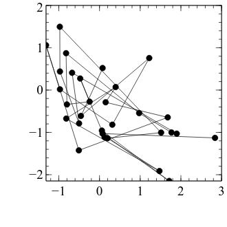
Before we get started on how we can calculate correlation coefficients and test whether they are significantly different from zero, let’s first look at how we can visualise such relationships. We will use a scatter plot to relate the data from the first condition (x axis) with the data from the second condition (y axis). First, we will set up the figure framework as we have done previously:
import numpy as np

import veusz.embed

n = 30

true_corr = -0.5

# don't worry too much about this - just a way to generate random numbers with
# the desired correlation
cov = [[1.0, true_corr], [true_corr, 1.0]]

data = np.random.multivariate_normal(
    mean=[0.0, 0.0],
    cov=cov,
    size=n
)

embed = veusz.embed.Embedded("veusz")

page = embed.Root.Add("page")
page.width.val = "8.4cm"
page.height.val = "8.4cm"

graph = page.Add("graph", autoadd=False)

x_axis = graph.Add("axis")
y_axis = graph.Add("axis")

embed.WaitForClose()
Creating a scatter plot is actually a straightforward extension of a figure that we made in the last lesson, using the xy figure type.
All we need to do is tell veusz about the data from the two conditions, create an xy figure element, and bind the data from the two conditions to the x and y axes:
import numpy as np

import veusz.embed

n = 30

true_corr = -0.5

# don't worry too much about this - just a way to generate random numbers with
# the desired correlation
cov = [[1.0, true_corr], [true_corr, 1.0]]

data = np.random.multivariate_normal(
    mean=[0.0, 0.0],
    cov=cov,
    size=n
)

embed = veusz.embed.Embedded("veusz")

page = embed.Root.Add("page")
page.width.val = "8.4cm"
page.height.val = "8.4cm"

graph = page.Add("graph", autoadd=False)

x_axis = graph.Add("axis")
y_axis = graph.Add("axis")

embed.SetData("x_data", data[:, 0])
embed.SetData("y_data", data[:, 1])

xy = graph.Add("xy")

xy.xData.val = "x_data"
xy.yData.val = "y_data"

embed.WaitForClose()
Ok, we have made a bit of progress—but before it can start to look like a good scatter plot, let’s first apply the formatting changes that we typically do.
We also set a graph property that we haven’t come across before, aspect, to 1.0—this makes the graph equally wide and tall, which is useful for scatter plots.
We also set the axes to be symmetric about zero and the same for x and y.
import numpy as np

import veusz.embed

n = 30

true_corr = -0.5

# don't worry too much about this - just a way to generate random numbers with
# the desired correlation
cov = [[1.0, true_corr], [true_corr, 1.0]]

data = np.random.multivariate_normal(
    mean=[0.0, 0.0],
    cov=cov,
    size=n
)

embed = veusz.embed.Embedded("veusz")

page = embed.Root.Add("page")
page.width.val = "8.4cm"
page.height.val = "8.4cm"

graph = page.Add("graph", autoadd=False)

x_axis = graph.Add("axis")
y_axis = graph.Add("axis")

embed.SetData("x_data", data[:, 0])
embed.SetData("y_data", data[:, 1])

xy = graph.Add("xy")

xy.xData.val = "x_data"
xy.yData.val = "y_data"

graph.aspect.val = 1.0

axis_pad = 0.5

axis_extreme = np.max(np.abs(data)) + axis_pad

graph.Border.hide.val = True

typeface = "Arial"

for curr_axis in [x_axis, y_axis]:

    curr_axis.min.val = float(-axis_extreme)
    curr_axis.max.val = float(+axis_extreme)

    curr_axis.Label.font.val = typeface
    curr_axis.TickLabels.font.val = typeface

    curr_axis.autoMirror.val = False
    curr_axis.outerticks.val = True

x_axis.label.val = "Condition 1"
y_axis.label.val = "Condition 2"

embed.WaitForClose()
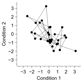
One problematic aspect of the current figure is that successive participants have their data points joined by a line. The ordering of participants is not relevant to the current analysis, so let’s turn them off:
import numpy as np

import veusz.embed

n = 30

true_corr = -0.5

# don't worry too much about this - just a way to generate random numbers with
# the desired correlation
cov = [[1.0, true_corr], [true_corr, 1.0]]

data = np.random.multivariate_normal(
    mean=[0.0, 0.0],
    cov=cov,
    size=n
)

embed = veusz.embed.Embedded("veusz")

page = embed.Root.Add("page")
page.width.val = "8.4cm"
page.height.val = "8.4cm"

graph = page.Add("graph", autoadd=False)

x_axis = graph.Add("axis")
y_axis = graph.Add("axis")

embed.SetData("x_data", data[:, 0])
embed.SetData("y_data", data[:, 1])

xy = graph.Add("xy")

xy.xData.val = "x_data"
xy.yData.val = "y_data"

xy.PlotLine.hide.val = True

graph.aspect.val = 1.0

axis_pad = 0.5

axis_extreme = np.max(np.abs(data)) + axis_pad

graph.Border.hide.val = True

typeface = "Arial"

for curr_axis in [x_axis, y_axis]:

    curr_axis.min.val = float(-axis_extreme)
    curr_axis.max.val = float(+axis_extreme)

    curr_axis.Label.font.val = typeface
    curr_axis.TickLabels.font.val = typeface

    curr_axis.autoMirror.val = False
    curr_axis.outerticks.val = True

x_axis.label.val = "Condition 1"
y_axis.label.val = "Condition 2"

embed.WaitForClose()
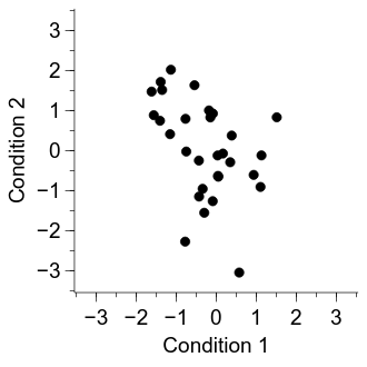
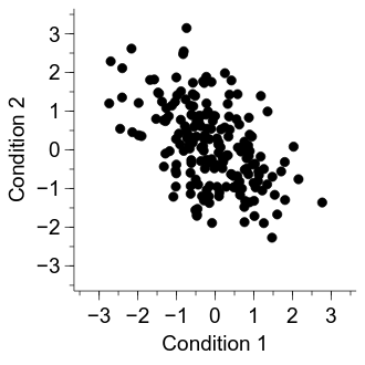
Now the figure is looking pretty good, but a final potential issue is that it is hard to see whether some of the dots overlap with one another. Let’s increase the number of participants to make the problem more apparent:
import numpy as np

import veusz.embed

n = 200

true_corr = -0.5

# don't worry too much about this - just a way to generate random numbers with
# the desired correlation
cov = [[1.0, true_corr], [true_corr, 1.0]]

data = np.random.multivariate_normal(
    mean=[0.0, 0.0],
    cov=cov,
    size=n
)

embed = veusz.embed.Embedded("veusz")

page = embed.Root.Add("page")
page.width.val = "8.4cm"
page.height.val = "8.4cm"

graph = page.Add("graph", autoadd=False)

x_axis = graph.Add("axis")
y_axis = graph.Add("axis")

embed.SetData("x_data", data[:, 0])
embed.SetData("y_data", data[:, 1])

xy = graph.Add("xy")

xy.xData.val = "x_data"
xy.yData.val = "y_data"

xy.PlotLine.hide.val = True

graph.aspect.val = 1.0

axis_pad = 0.5

axis_extreme = np.max(np.abs(data)) + axis_pad

graph.Border.hide.val = True

typeface = "Arial"

for curr_axis in [x_axis, y_axis]:

    curr_axis.min.val = float(-axis_extreme)
    curr_axis.max.val = float(+axis_extreme)

    curr_axis.Label.font.val = typeface
    curr_axis.TickLabels.font.val = typeface

    curr_axis.autoMirror.val = False
    curr_axis.outerticks.val = True

x_axis.label.val = "Condition 1"
y_axis.label.val = "Condition 2"

embed.WaitForClose()
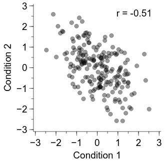
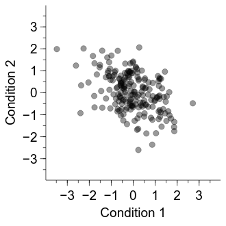
One solution that can work well is to make each of the dots a bit transparent—that way, it is more apparent when dots overlay one another. A downside of this approach is that figures with transparency can cause problems when exporting to PDF, so a bitmap-based approach is required.
import numpy as np

import veusz.embed

n = 200

true_corr = -0.5

# don't worry too much about this - just a way to generate random numbers with
# the desired correlation
cov = [[1.0, true_corr], [true_corr, 1.0]]

data = np.random.multivariate_normal(
    mean=[0.0, 0.0],
    cov=cov,
    size=n
)

embed = veusz.embed.Embedded("veusz")

page = embed.Root.Add("page")
page.width.val = "8.4cm"
page.height.val = "8.4cm"

graph = page.Add("graph", autoadd=False)

x_axis = graph.Add("axis")
y_axis = graph.Add("axis")

embed.SetData("x_data", data[:, 0])
embed.SetData("y_data", data[:, 1])

xy = graph.Add("xy")

xy.xData.val = "x_data"
xy.yData.val = "y_data"

xy.PlotLine.hide.val = True

xy.MarkerFill.transparency.val = 60
xy.MarkerLine.transparency.val = 60

graph.aspect.val = 1.0

axis_pad = 0.5

axis_extreme = np.max(np.abs(data)) + axis_pad

graph.Border.hide.val = True

typeface = "Arial"

for curr_axis in [x_axis, y_axis]:

    curr_axis.min.val = float(-axis_extreme)
    curr_axis.max.val = float(+axis_extreme)

    curr_axis.Label.font.val = typeface
    curr_axis.TickLabels.font.val = typeface

    curr_axis.autoMirror.val = False
    curr_axis.outerticks.val = True

x_axis.label.val = "Condition 1"
y_axis.label.val = "Condition 2"

embed.WaitForClose()
Now we have a good visualisation, let’s go ahead and calculate the correlation coefficient (Pearson’s correlation).
To do so, we can use scipy.stats.pearsonr.
This function takes two arguments, x and y, and returns a two-item list: the Pearson’s correlation (r) and a p value.
Let’s then note the obtained r value directly on the figure.
import numpy as np

import scipy.stats

import veusz.embed

n = 200

true_corr = -0.5

# don't worry too much about this - just a way to generate random numbers with
# the desired correlation
cov = [[1.0, true_corr], [true_corr, 1.0]]

data = np.random.multivariate_normal(
    mean=[0.0, 0.0],
    cov=cov,
    size=n
)

embed = veusz.embed.Embedded("veusz")

page = embed.Root.Add("page")
page.width.val = "8.4cm"
page.height.val = "8.4cm"

graph = page.Add("graph", autoadd=False)

x_axis = graph.Add("axis")
y_axis = graph.Add("axis")

embed.SetData("x_data", data[:, 0])
embed.SetData("y_data", data[:, 1])

xy = graph.Add("xy")

xy.xData.val = "x_data"
xy.yData.val = "y_data"

xy.PlotLine.hide.val = True

xy.MarkerFill.transparency.val = 60
xy.MarkerLine.transparency.val = 60

graph.aspect.val = 1.0

axis_pad = 0.5

axis_extreme = np.max(np.abs(data)) + axis_pad

graph.Border.hide.val = True

typeface = "Arial"

for curr_axis in [x_axis, y_axis]:

    curr_axis.min.val = float(-axis_extreme)
    curr_axis.max.val = float(+axis_extreme)

    curr_axis.Label.font.val = typeface
    curr_axis.TickLabels.font.val = typeface

    curr_axis.autoMirror.val = False
    curr_axis.outerticks.val = True

x_axis.label.val = "Condition 1"
y_axis.label.val = "Condition 2"

result = scipy.stats.pearsonr(x=data[:, 0], y=data[:, 1])
r = result[0]

r_fig = graph.Add("label")

r_fig.label.val = "r = {r:.2f}".format(r=r)
r_fig.xPos.val = 0.65
r_fig.yPos.val = 0.9
r_fig.Text.font.val = typeface

embed.WaitForClose()