Creating heatmap visualisations for posterior distributions
Here, I investigate a way to use a heatmap style of graph to visualise both a measure of central tendency and a measure of uncertainty by using a colour map that is formed from brightness and blue/yellow variations.
A “heatmap” can be a useful way of visualising data that varies across two dimensions. In this approach, the value of each data point is used to index into a lookup table (a “colour map”) that assigns a colour to the data point. This colour then constitutes a single cell in an image. Heatmaps are particularly useful when the dimensions are sampled at a large number of levels, where separating a dimension by multiple panels or by overlaid line plots becomes infeasible or visually uninformative.
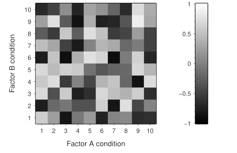
For example, say if we have made measurements across two factors (A and B) that each has 10 levels. We could create a heatmap by associating the lowest values with black and the highest values with white for visualisation as an image such as below:
Note though that heatmaps are not a particularly precise method of visualisation. Our visual mechanisms are not photometers and are subject to many spatial and temporal context effects that affect how we perceive the colours in a heatmap. Additionally, such mechanisms also vary across individuals—with anomalous colour vision being perhaps the most well-known example. Furthermore, we often have little control over how heatmaps are displayed to viewers and differences in the fidelity of colour reproduction can have considerable effect on heatmap appearance.
A challenge with using heatmaps, which I want to consider here, is how they can be used when we have multiple values to visualise within each cell. This is particularly relevant when using a Bayesian approach, which emphasises the importance of communicating the uncertainty that is attached to each estimate. For example, we might have say 5,000 samples from a posterior distribution for each cell in our heatmap. If we can only communicate a single value in each cell, we would likely visualise a measure of central tendency like the median—but we would then lose the capacity to communicate anything else about the distribution.
A potential approach is to use the multi-dimensional nature of our visual perception to communicate the measure of central tendency in brightness variation and a measure of uncertainty in chromatic variation.
Ideally, we would want such brightness and chromatic dimensions to be independent and, for many applications, perceptually linear.
A suitable colour space for such requirements is the Oklab colour space (created by Björn Ottosson).
This colour space contains three dimensions, labelled L (brightness), a (green/red variation), and b (blue/yellow variation).
The L channel is typically described as representing “lightness”.
However, I prefer to use “brightness” because lightness tends to be reserved, in visual perception research, for the subjective perception of apparent surface reflectance (the proportion of light reflected from a surface).
Here, we will use the L and b channels in Oklab space.
The image below shows colours that are produced by variations in the L and b channels.
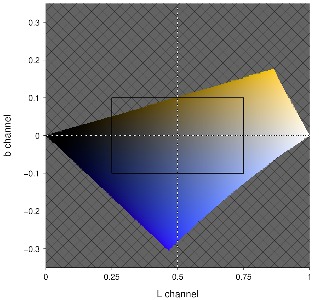
L and b channels in Oklab colour space. The grey cross-hatching shows regions with undisplayable colours. The black rectangle shows the region that will be used to create a colour map.The above image highlights that there are many coordinates in Oklab colour space that are not able to be represented in the sRGB colour space (which is assumed to be the colour space of the display medium). We thus need to carefully choose the regions in Oklab space that we will use so that they lie within the sRGB gamut. Here, we will use the region shown by the black rectangle in the above image.
But doesn’t the region contain an area of colours that cannot be represented?
Yes, but that is likely to be OK given the form of the uncertainty summary that will be mapped to the b channel.
Here, we will use the posterior probability of the value being above some reference value (such as zero, which we will use here).
The rationale for this summary is to provide an indication of how the measure of central tendency is positioned with regards to the uncertainty; for example, a median of 0.1 would likely be interpreted differently if we know that the posterior probability of being above zero was 60% compared to if it was 99%.
A consequence of this choice of uncertainty representation is that we don’t need to be too concerned about being out of gamut in the upper-left and lower-right quadrants of the L by b space—assuming a median measure of centrality and a symmetric colour mapping about 0.5 on the L channel and 0 on the b channel, we won’t really need to use those two quadrants.
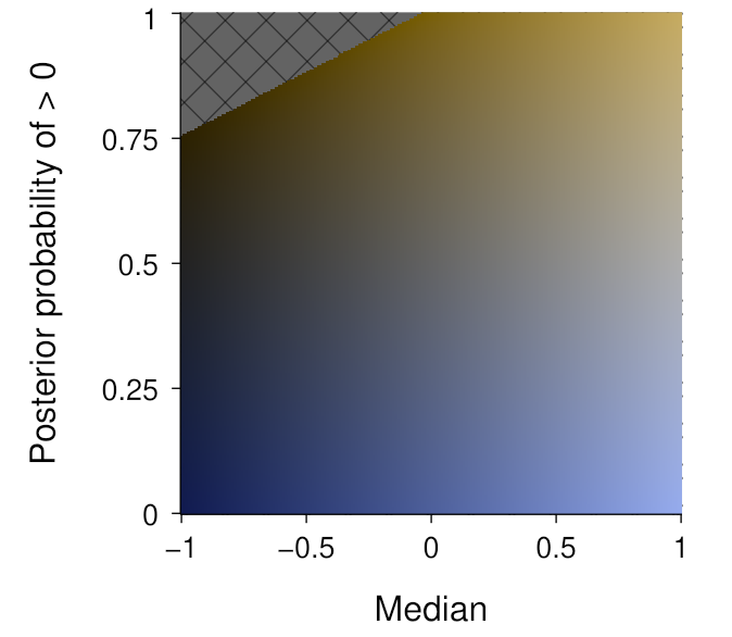
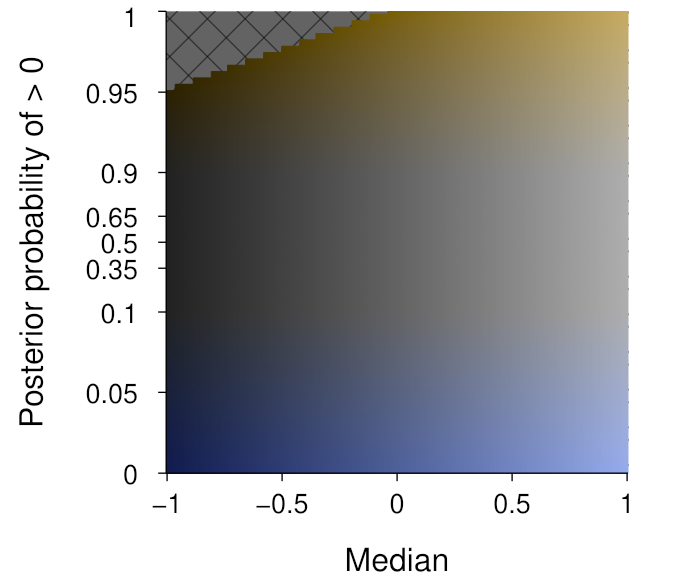
Now, we can map this region to the median and above-zero posterior probability values, such as shown below. Note that the latter is constrained to lie within the [0, 1] interval, whereas the former is dependent upon the data being visualised.
The above assumes a linear mapping from the relevant data value to the relevant Oklab channel. While this seems appropriate for a measure of centrality like the median, it is probably less appropriate for the posterior probability of being above zero. For this quantity, we are likely to be mostly interested in distinguishing values around the extremes of the dimension. We can thus keep the variation in colourfulness for the tails, and vary linearly in the say 0%–10% range and the 90%–100% range. We do need to be a bit careful here though, since such a mapping choice is essentially imposing a threshold on what is being communicated. This produces the mapping shown below:
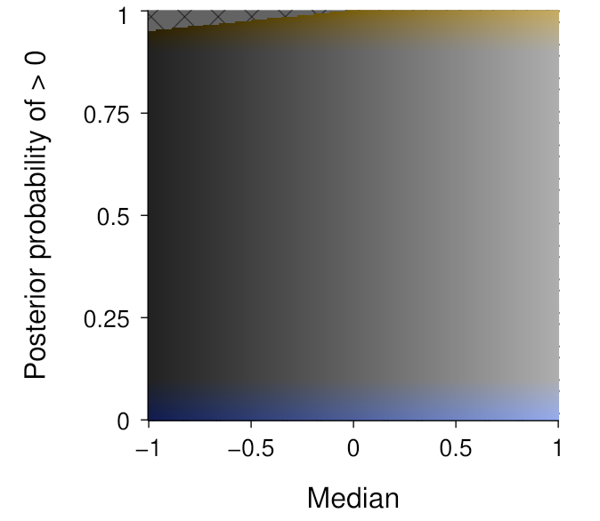
As you can see, most of the above-zero probability dimension is lacking in colour—except for the upper and lower extremities. We do not necessarily need to display this dimension linearly, and the expanded tails in the below visualisation can help to understand the variation in colourfulness:
Finally, we can now use this colour map to visualise the example data—for which we previously only viewed the median via a greyscale mapping:
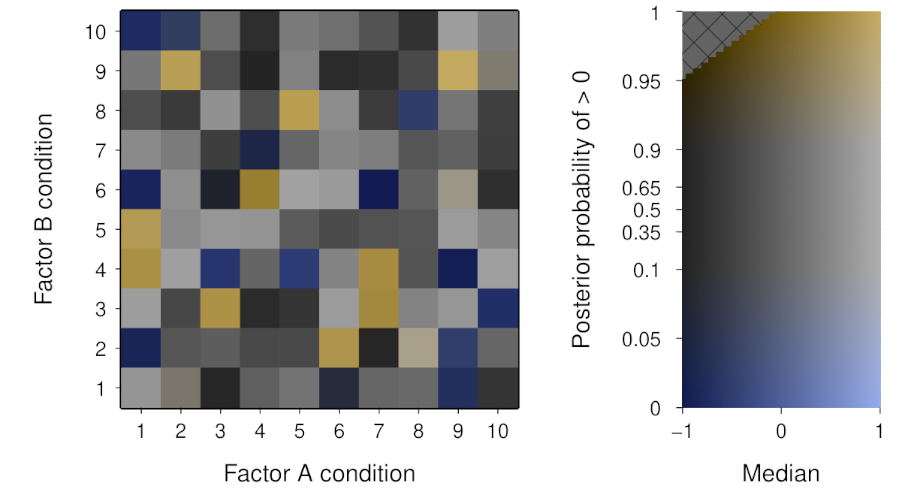
We now are able to communicate a sense of the uncertainty of the posterior distribution in addition to the measure of central tendency. The variation in colourfulness is a very salient cue to those cells with a high probability of being different from the reference value. Depending on the application, this could be a potential downside if it promotes an overly-dichotomous interpretation. As always, whether this is a useful approach will depend on the goals of the visualisation.