Creating figures
Objectives
- Be able to create the framework for a figure using Python and veusz.
- Create a histogram.
- Be able to change the formatting details of a figure.
- Understand the different figure file formats and how to save figures.
In this lesson, we will be introducing the veusz package and using it to make publication-quality figures. We’ll also start thinking about what makes a figure “publication-quality”.
Setting up a figure
First, we need to understand how we go about constructing a figure using veusz.
To add the functionality of veusz to Python, we need to import it.
For veusz, we actually need to import a subpackage called embed.
We do this by:
import veusz.embed
Then, we need to create a veusz window that we can draw to.
We do that using the veusz.embed.Embedded function, which takes an argument that sets the window title.
This isn’t important, but we’ll set it to veusz.
So that we can see what we have drawn, we then ask veusz to keep the window open until we close it.
import veusz.embed

embed = veusz.embed.Embedded("veusz")

# do all our drawing and formatting in here

embed.WaitForClose()
At this point, all we have is a blank window.
We begin by adding a “page”—a canvas on which we can draw our figure.
It is important to start thinking about what the figure is going to look like, because this will affect how large we make the page.
Let’s assume we’re preparing a figure for publication in a journal.
Typically, these can occupy either one or two columns of a printed page—corresponding to a figure width of either 8.4cm or 17.5cm.
Here, we’ll make a one-column figure that is slightly wider than high.
We do this by setting the .width.val and .height.val properties of the page to their respective quantities, specified as a string and with the units.
import veusz.embed

embed = veusz.embed.Embedded("veusz")

page = embed.Root.Add("page")
page.width.val = "8.4cm"
page.height.val = "6cm"

embed.WaitForClose()
Now we have our page, we can add a graph to it.
When doing this, we also use the argument autoadd=False to indicate that we will create the axes in the graph ourselves, which we then go ahead and do.
import veusz.embed

embed = veusz.embed.Embedded("veusz")

page = embed.Root.Add("page")
page.width.val = "8.4cm"
page.height.val = "6cm"

graph = page.Add("graph", autoadd=False)

x_axis = graph.Add("axis")
y_axis = graph.Add("axis")

embed.WaitForClose()
This creates the basic organisation of our figure:
Specifying the data to show in the figure
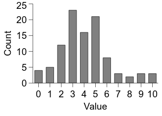
In this lesson, we’re going to create a histogram.
We have been using random numbers quite a bit so far, so let’s look at the distribution of samples drawn from a Poisson distribution (the details of this distribution are not important—we use it here because it involves integers, which are easier to use in histograms).
We can draw such samples using the np.random.poisson function.
Let’s draw 100 samples from the distribution.
We can do this by the following code (for clarity, this code will be presented in isolation from the figure code. We will fold it back in later):
import numpy as np

n_samples = 100

samples = np.random.poisson(lam=4, size=n_samples)
Now, for our histogram we need the bin locations on the x axis and the bin counts on the y axis.
But all we have at the moment is the array of samples.
We can use the function np.bincount to count how many samples correspond to the range of integers present in the samples.
import numpy as np

n_samples = 100

samples = np.random.poisson(lam=4, size=n_samples)

bin_counts = np.bincount(samples)

bins = np.arange(np.max(samples) + 1)
Connecting the data to the figure
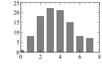
Now we have our data, we can go ahead and depict it in our figure. Accordingly, we will fold the code above back into our main figure code. Then we will create a bar graph, as is conventionally used to display this kind of count data.
We create a bar graph by first using the Add function of our graph variable, with the argument "bar" to indicate a bar graph.
Then, we need to bind our two pieces of data (the bin locations and the bin counts) to the graph.
First, we tell veusz about the data using the SetData method, which takes as arguments a name that we can refer to it by and the data array.
Then, we set the .posn.val and .lengths.val properties of our bar variable to the names we gave to the bin location and bin count data, respectively.
After this, we can see that we are getting somewhere!
import veusz.embed
import numpy as np

n_samples = 100

samples = np.random.poisson(lam=4, size=n_samples)

bin_counts = np.bincount(samples)

bins = np.arange(np.max(samples) + 1)

embed = veusz.embed.Embedded("veusz")

page = embed.Root.Add("page")
page.width.val = "8.4cm"
page.height.val = "6cm"

graph = page.Add("graph", autoadd=False)

x_axis = graph.Add("axis")
y_axis = graph.Add("axis")

bar = graph.Add("bar")

embed.SetData("bins", bins)
embed.SetData("bin_counts", bin_counts)

bar.posn.val = "bins"
bar.lengths.val = "bin_counts"

embed.WaitForClose()
Improving the figure’s appearance
Now let’s work to add in the details on the figure and to improve its general appearance. Note that since we’re drawing random samples, the distribution that is shown in subsequent figures will change slightly.
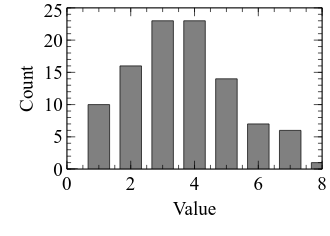
First, let’s set the axis labels. We don’t know what the samples represent in this example, so let’s just give them generic names:
import veusz.embed
import numpy as np

n_samples = 100

samples = np.random.poisson(lam=4, size=n_samples)

bin_counts = np.bincount(samples)

bins = np.arange(np.max(samples) + 1)

embed = veusz.embed.Embedded("veusz")

page = embed.Root.Add("page")
page.width.val = "8.4cm"
page.height.val = "6cm"

graph = page.Add("graph", autoadd=False)

x_axis = graph.Add("axis")
y_axis = graph.Add("axis")

bar = graph.Add("bar")

embed.SetData("bins", bins)
embed.SetData("bin_counts", bin_counts)

bar.posn.val = "bins"
bar.lengths.val = "bin_counts"

x_axis.label.val = "Value"
y_axis.label.val = "Count"

embed.WaitForClose()
Now let’s make some changes to the x axis. Looking at the above, there are a few changes that could be useful in improving the clarity of the figure:
- The minimum value on the axis could be reduced a bit to accommodate the bar at 0.
- The maximum value on the axis could be increased a bit to accommodate the bar at the largest bin.
- The minor ticks don’t add much, so let’s remove them.
- There is enough space to include all the major tick labels, so let’s add them.
- There is not much to be gained by having the additional axis at the top of the figure, so let’s remove it.
- The tick marks pointing upwards might interfere with our ability to see low values, so let’s point them downwards instead.
We can implement such changes as follows:
import veusz.embed
import numpy as np

n_samples = 100

samples = np.random.poisson(lam=4, size=n_samples)

bin_counts = np.bincount(samples)

bins = np.arange(np.max(samples) + 1)

embed = veusz.embed.Embedded("veusz")

page = embed.Root.Add("page")
page.width.val = "8.4cm"
page.height.val = "6cm"

graph = page.Add("graph", autoadd=False)

x_axis = graph.Add("axis")
y_axis = graph.Add("axis")

bar = graph.Add("bar")

embed.SetData("bins", bins)
embed.SetData("bin_counts", bin_counts)

bar.posn.val = "bins"
bar.lengths.val = "bin_counts"

x_axis.label.val = "Value"
y_axis.label.val = "Count"

# veusz can be picky about its numbers - here, we get Python to convert the
# result of the max function to a decimal (called a float)
x_axis.min.val = -0.5
x_axis.max.val = float(np.max(bins) + 0.5)
x_axis.MinorTicks.hide.val = True

# veusz requires the manual tick locations to be specified as a list of
# decimals, whereas we currently have them as a numpy array
x_axis.MajorTicks.manualTicks.val = bins.tolist()

x_axis.autoMirror.val = False
x_axis.outerticks.val = True

embed.WaitForClose()
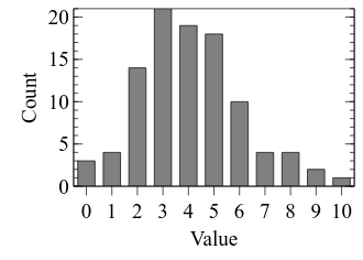
Our figure is looking better, but there are a few new and potentially tricky aspects of the above code that we will need to review.
First, notice that we’ve used a new function, float when specifying the maximum of the x axis.
This is because veusz can be rather picky about the type of data you give it.
Because we were using numpy arrays, we have to explicitly convert the output into a Python decimal number.
Such values are called “floats”.
Second, we’ve used a new function attached to a numpy array, tolist.
Unsurprisingly, this converts the array into a Python list data type, which is what veusz is expecting for this component of the graph.
Next, we will consider the y axis. Again, we will apply many of the same modifications as we did for the x axis. We will also remove the frame around the figure, and change the typeface of the text to a sans-serif variant (such as Arial).
import veusz.embed
import numpy as np

n_samples = 100

samples = np.random.poisson(lam=4, size=n_samples)

bin_counts = np.bincount(samples)

bins = np.arange(np.max(samples) + 1)

embed = veusz.embed.Embedded("veusz")

page = embed.Root.Add("page")
page.width.val = "8.4cm"
page.height.val = "6cm"

graph = page.Add("graph", autoadd=False)

x_axis = graph.Add("axis")
y_axis = graph.Add("axis")

bar = graph.Add("bar")

embed.SetData("bins", bins)
embed.SetData("bin_counts", bin_counts)

bar.posn.val = "bins"
bar.lengths.val = "bin_counts"

x_axis.label.val = "Value"
y_axis.label.val = "Count"

# veusz can be picky about its numbers - here, we get Python to convert the
# result of the max function to a decimal (called a float)
x_axis.min.val = -0.5
x_axis.max.val = float(np.max(bins) + 0.5)
x_axis.MinorTicks.hide.val = True

# veusz requires the manual tick locations to be specified as a list of
# decimals, whereas we currently have them as a numpy array
x_axis.MajorTicks.manualTicks.val = bins.tolist()

x_axis.autoMirror.val = False
x_axis.outerticks.val = True

y_axis.MinorTicks.hide.val = True
y_axis.autoMirror.val = False
y_axis.outerticks.val = True

graph.Border.hide.val = True

typeface = "Arial"

for curr_axis in [x_axis, y_axis]:
    curr_axis.Label.font.val = typeface
    curr_axis.TickLabels.font.val = typeface

embed.WaitForClose()
Note the use of a for loop in the above code.
Because we wanted to apply the same statements to both the x and y axes, we can create a list and loop over it rather than type the commands separately for each axis.
Saving the figure
Now we have a nice looking figure, the final step is to save it into a format that we can include in our document. The primary decision we need to make here is whether to save it in a vector or bitmap format. A vector-based format (such as PDF and SVG) stores the component as shapes, which can often allow for smaller file sizes and intact resolution at multiple scales (i.e. zoom friendly). The downsides are that not all software supports this format (Word, notably) and it can struggle with some figure aspects such as transparency. The alternative is a bitmap-based format (such as PNG and TIFF) that creates a pixel-by-pixel representation. When created for publication, these files need to be created with a high DPI (dots per inch) such as 600.
Let’s save a few different formats.
We can do this using embed.Export at the end of our code, as follows:
embed.Export("poisson.pdf", backcolor="white")

for dpi in [72, 600]:
    embed.Export(
        "poisson_{dpi:n}.png".format(dpi=dpi),
        backcolor="white",
        dpi=dpi
    )
A new element in the above code is the use of string formatting via the .format function.
This allows us to embed string representations of variables within other strings.
By using the braces ({ and }), we are saying that we are going to specify a variable called dpi that is a number (n).
The format function then inserts it into the string, allowing us to embed the dpi value in the filename.